
Interaction'18
Cover page and model with "ingredients" or components wherein each of these has a large number of creative possibilities. Knowledge about users needs and strategy (the ingredients in the middle) can influence the choices in the circle ingredients.
This shows one page from the document, about what I defined as Input Options, one of the ingredients in the model. Each ingredient in the model has one page with questions for the designer.
Another page with the ingredient I defined as Conversational Architecture.
Want to shape the right discussion online?@NinaLysbakken’s work on ‘Conversational Spaces’ (i.e. not just the same ol’ comment box at the end of the page) can help. @ixdconf pic.twitter.com/0goWpezv8I
— Ashish Goel (@ashpodel) February 7, 2018

Caught @NinaLysbakken's amazing and very relevant talk about designing conversational interfaces at #ixd18 from the @idean HQ today. Now I need to dig into everything she has learned in her research on the topic. #ux #social https://t.co/DNK21jgLV8 pic.twitter.com/ioZJl0iPdh
— Jon 🦊 Fox | UX (@JonFoxUX) February 6, 2018
Different conversations require different designs, says @NinaLysbakken at #IxD18 pic.twitter.com/4xpeXQvnC9
— Sigrun Lurås (@sigrunl) February 6, 2018

@NinaLysbakken dro til Lyon i Frankrike for å presentere doktorgradsarbeidet sitt. 🇫🇷 Neste frist for å søke UDs #reisestøtte for #designere og #arkitekter er 15. mars. 💶 https://t.co/tZ3YlBwbTb pic.twitter.com/T3AbOpEis0
— DOGA (@doganorway) February 19, 2018
I couldn't embed the video for some reason. The video is in norwegian, but see slides and english information below.
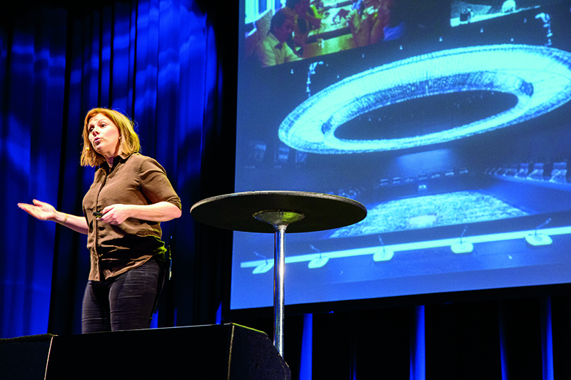
Me. On stage.
Facebook Reactions are designed to make you post more than those cosy family pictures many previously posted on Facebook. They have provided ways of expressing yourself as angry and sad, and made way for people to share e.g. upsetting news and serious matters. These choices are also shaping how we view Facebook as a room for conversations.
SnapChat filters are also providing a way for you to express yourself in a funny, weired or amusing way. These designed choices for expressing yourself can give us an impression of SnapChat as a quick and funny "room for conversations". (The filters are not the only reason, but a part of the combination of designed choices SnapChat has made.)
I want us to look at the design of digital rooms in the same way as physical rooms: some are designed for fun, some for debate, some for board meetings, and some even for secrets. These rooms are designed with different colours, chairs, curtains, arrangement, tables and materials. Some are limited to only two people, some are open for every one who wants to come in. Can we look at digital rooms and their typography, colours, layout, navigation and input options (meaning the open fields where you can write, scales, polls, or the predefined choices of SnapChat filters and Facebook Reactions) in the same way? How could a typeface or graphics communicate that it is a fun and cosy place, like the coloured bean bags? What kind of values could we picture that the room could symbolize? When you enter an old, beautiful church, you may get a sense of awe, or feeling small. What do we want you to feel when you enter a debating space online?
Todays commenting fields are often put at the bottom of the site. How important do you feel if placed at the back of the auditorium? Does it feel like your voice matter, when the newspapers never read the commenting fields? I compare the room of the commenting fields to the rooms of sterile, white halls at hospitals. Grey, white, and similar sans-serif fonts in every commenting field. They could have used fonts, colours and graphics that reminds us of something seriousness and reflected, or perhaps more entertainment and fun – which would have indicated different values of this room. This design can imply cold, narrow and sterile. Which MAY have an effect on the debate itself, because it is related to how we perceive this space.
My sketch shows a placement of the conversation that is lifted up in the layout and hierarchy of the site. It shows use of colours and graphics to indicate mood and emotions. It shows what I call "targeted feedback"; an invitation to say something specific. It says "I am", and then you must choose a predefined emoji. Then it says "because" (fordi…), and THEN you can write what you are angry, curious, happy etc about. The red bubble says "I am angry because…", the blue "I am glad because…", the green "I am curious because…". It means that the design is pushing your comment into a specific format. It pushes you to talk about YOUR emotions, rather than to let your anger be implicit in an attack on others. I intended the concept to be moderated in a different way than comment fields normally are today: diverse comments are moderated in, meaning picking the comments that are interesting for the public, that shows the varied opinions surrounding this topic. The rest will not be visible. Meaning that the goal is DIVERSE comments and perspectives, not a load of comments from ONE perspective).

One of my slides about designing different "rooms for conversations" online… SayNoMore!

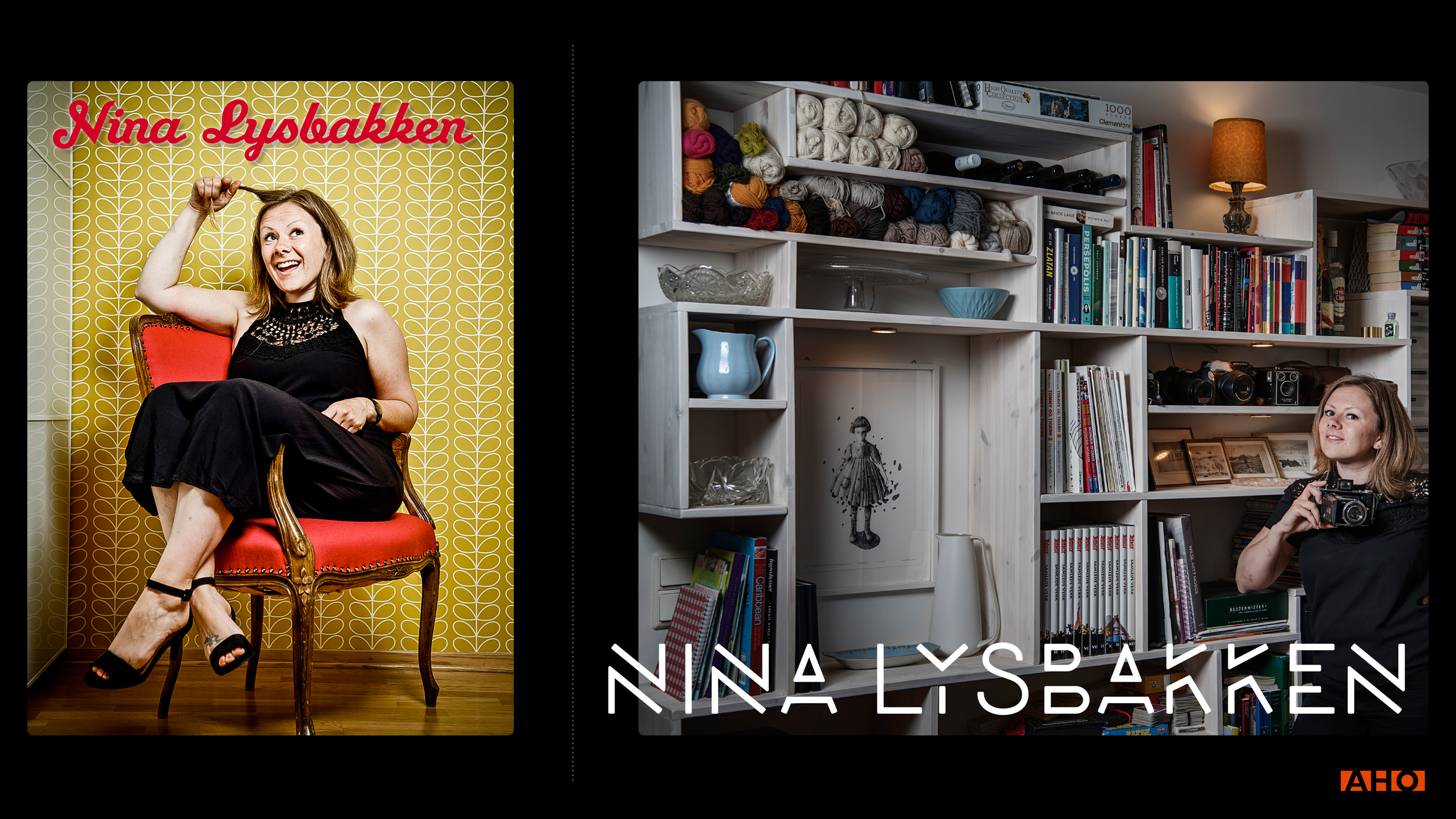
I'm gonna talk about these images of me as pictures, fonts and colours that tells a story about a person, that may give you an image or enforce your prejudice of who I am. … and I've hidden a callback here…!